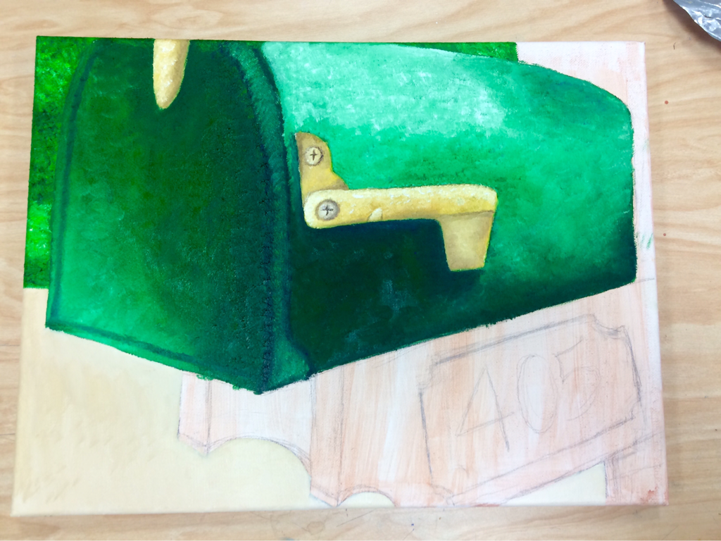
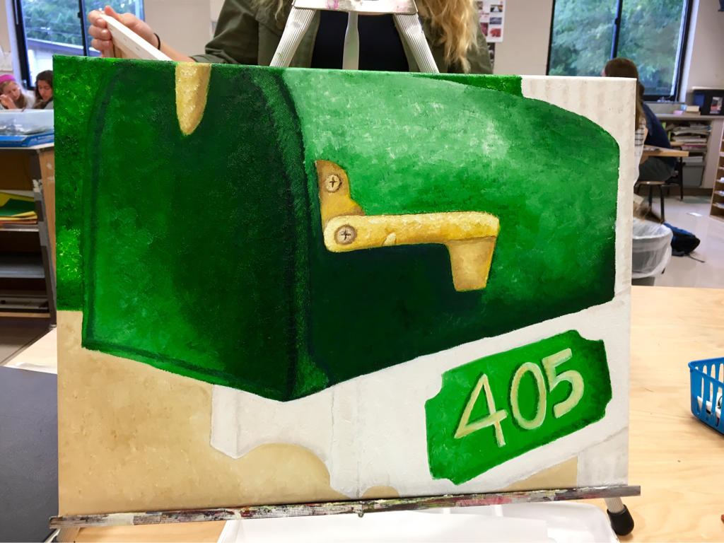
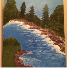
This is the oil painting I did for the everyday projects painting. I didn't know what to do for this project so I randomly took pictures of my mailbox and then chose to do it. This is the first oil painting that I have ever done. At first I did not like the oil paint because it was so thick and it took so long to dry but once I got the hang of it I really liked it. My favorite part about this is the mailbox itself, I don't like the number because I feel like I could have taken my time and made it look better. Getting all the greens to look different yet look good together was also a big challenge. There was so much green in this picture that I was scared that it was all going to blend together and look the same. I like the way it turned out l, but I think that my biggest challenge was getting the dark's and lights placed correctly. I think the oil paint was a good choice for this and I liked the way it blended together so easily. The only thing I didn't like about it was that it took so long to dry and that it smudged easily. But, overall I think this was pretty successful, not the best, but I think it turned out alright.
This is the oil painting that I did with a palette knife. I did not like working with this tool because I felt like I had no control over how the colors ended up looking and the general shape of things. This is the oil paining I did with oil paint and a brush. I liked how smoothly the paint went on and how bright the colors were. This was the second time I had ever used oil paint and before I had not liked it but after this I think I do.
This is the self portrait that I did over the summer. My favorite color is blue so that is why I ended up using a lot of blue. I used acrylic paint, I really like working with acrylic paint because I have gotten used to working with it over the time I've been using it. I like how this turned out, although it gives off a sad vibe that wasn't my original intention. This is a portrait of my golden retriever puppy. I used prisma colored pencils to create the image. I used many shades of brown and yellow to create the color of the fur. Overall I am happy with the way way it turned out except for the right side of my puppy's face. I got the proportion wrong and the eye got messed up. This is the drawing I did for the topic of drawing something in water. This is a birds eye view of my water bottle and I always add lemons to my water so when I took the picture I liked the way the colors looked. I did this one in prisma colored pencils. this one was my first real drawing working with them and I really liked how easily they blended together and how bright the colors turned out. I am happy with the way this turned out. This is the drawing of the 3 glass bottle arrangement. I used prisma colored pencils. I used a bunch of different colors to create the color of the bottle. I think the most challenging part of this drawing was creating the reflections and making the proportions right. I do think this ended up looking good, the only thing I don't like about it is the shadows that I added. This was my mini concentration. I did two paintings with acrylic paint, one of a landscape and the to her of the sky/clouds. I really like painting clouds because the different shadows and reflections of the sun make them challenging but fun to paint. I also like painting landscapes because there is something calming I find in painting them. I like the way these two turned out although I think the one of the sky could use something in the middle but, overall I like the way they look.
When were given the guidelines to this project, I had no idea what to do. I went home and took some pictures and still I couldn't find something I wanted to do. Before ending up with the idea of doing this one, I switched pictures twice. This is a picture I took during third period one day while the lights were off in the classroom. The reflection that the bottom of my water bottle was on the table and I really liked the way it looked. As I started this project, I realized that the water bottle did have a lot of reflections and getting the shapes right was difficult. In the video that Mrs. Rossi showed us in class, the artist drawing the wine glass said not to use black because it made the drawing look 2D so I wanted to try not to use it. Instead, I used dark brown first and then a dark blue to obtain a natural black. Working with the prismas was great because they blend together so well and really let you have control over how you want details to look. In the end I just wanted to finish this project and move on to the next one. I do not like the way it turned out and I know I can do much better than that for a project and I am excited to move on and show what I really can do on the projects to come.
|